


Brand Strategy, Verbal Identity, Brand Language, Visual Identity, Packaging, Digital Concepts, Apparel, Merch, Guidelines
Rebrand of Frizzenti’s ready-to-drink cocktail range as Liberation, serving up perfect moments whenever and wherever the moment strikes.
“Throughout the rebrand, Popp has expertly guided us through the strategic, creative and production process, and given us a dynamic brand identity that sets us up to accelerate growth and celebrate Liberation from Lockdown.”
– George Workman, Managing Director & Co-Founder, Liberation Cocktails
Liberation’s brand story bubbles with playful language, reinforcing its distinctive personality and points of difference.
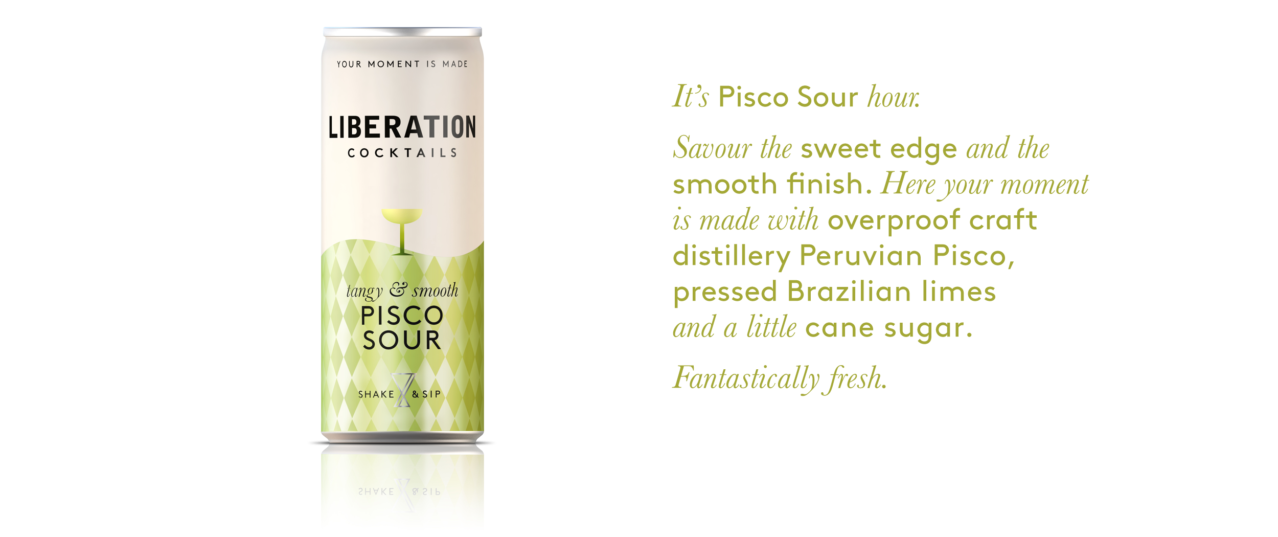
The strapline, “Your moment is made”, takes consumers to that cocktail moment, and emphasises how easy it is to enjoy with Liberation’s pre-batched offering.
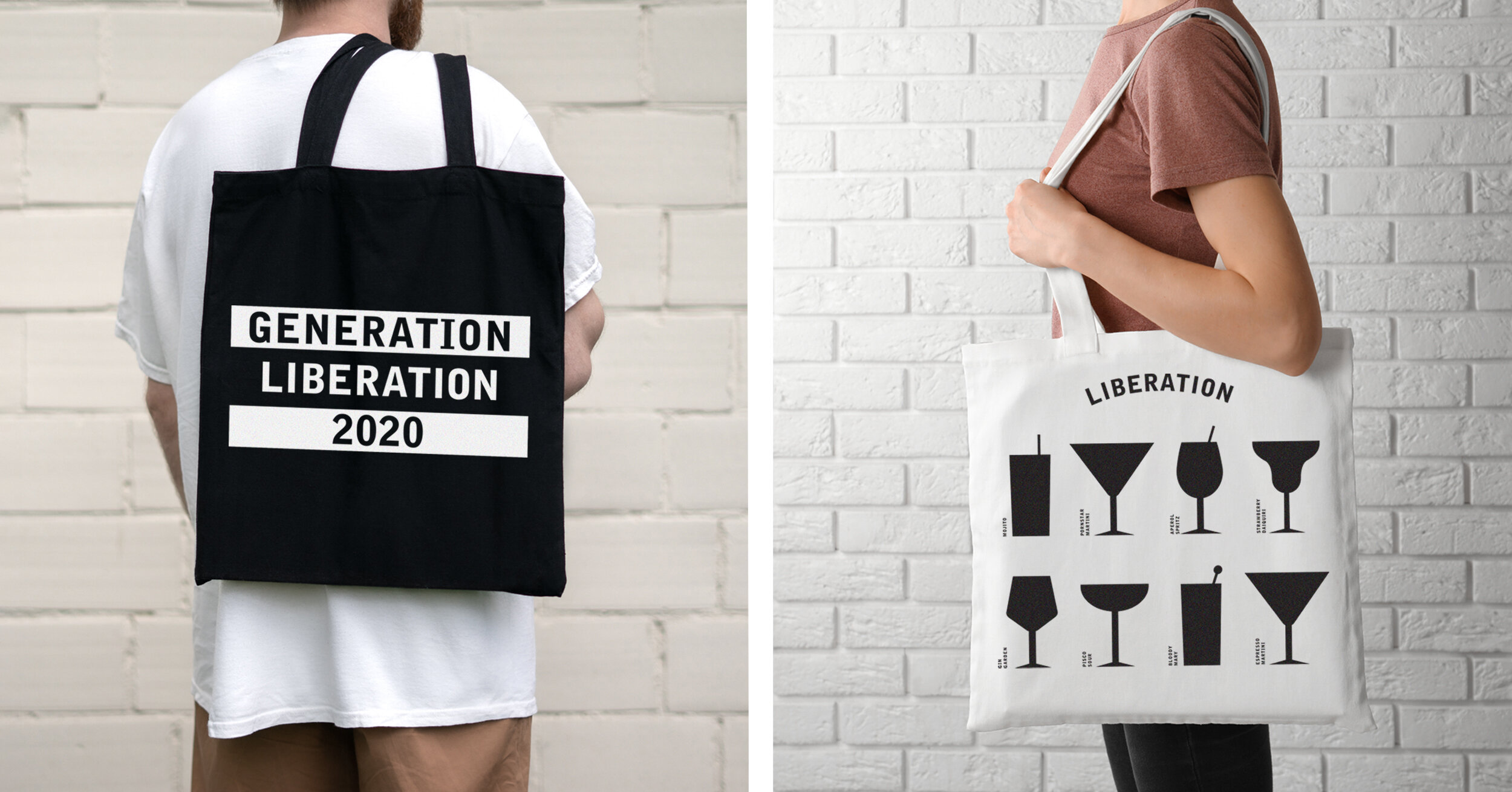
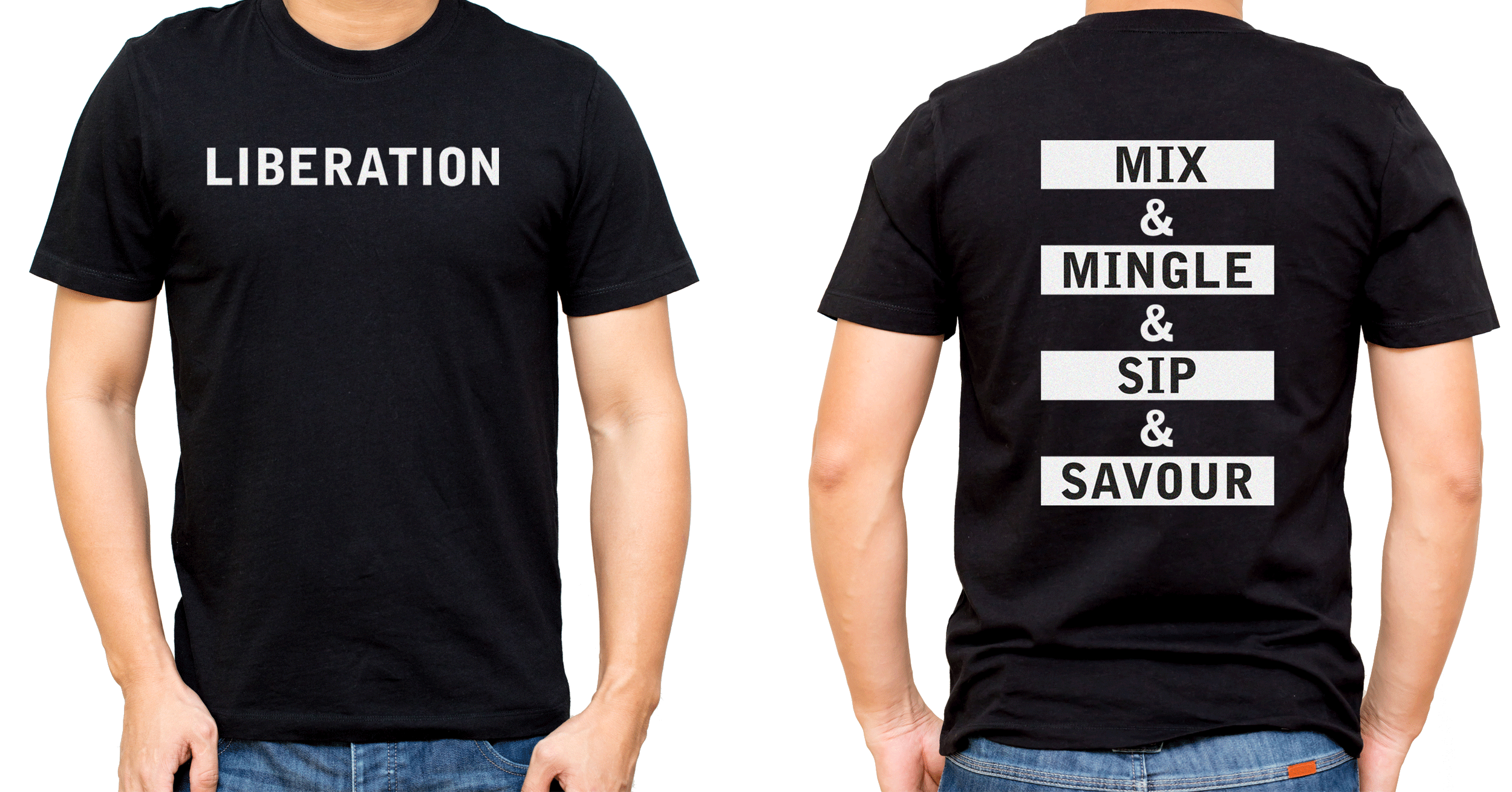
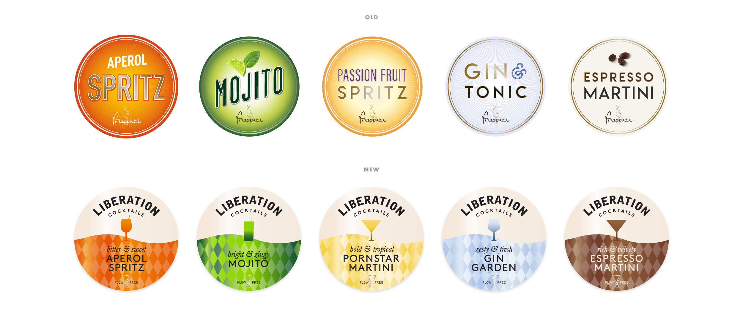
Brand language plays a key role in the brand world. With the brand’s launch at the easing of Lockdown, apparel and merchandise declares “Generation Liberation 2020” as well as “Shake it to make it”, which also appears on bottles and cans.
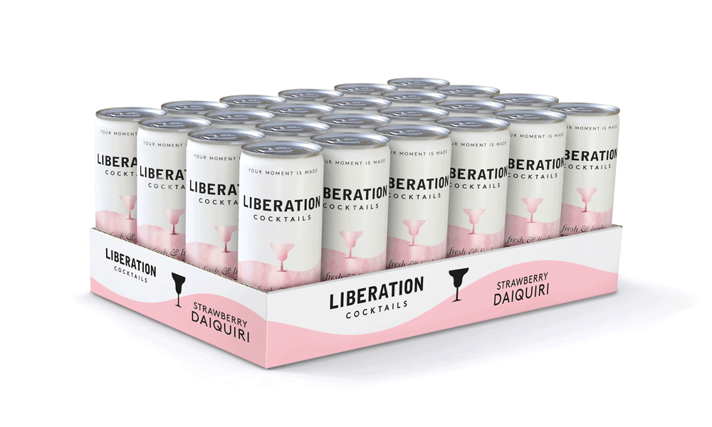
The Shimmering Wave is filled with a diamond motif that gleams with the colour of each liquid and makes it feel extra special. It mimics the sensation of the cocktail being poured into your glass, and is easy to recognise from across a bar or in a shop. It also allows the masterbrand clear space without compromising on variant navigation or taste cues.
The wordmark adapts to each touchpoint, sitting straight on bottles and cans, whilst curving around tap signs to amplify its presence.
Liberation’s distinctive assets make the brand instantly recognisable and stand out amidst the loud crowd of competitors all adopting variant-first design strategies.
The previous design also adopted this approach, with the brand name barely visible.
Each variant has a glass silhouette at its heart, and at the base sits the Infinite Jigger. This is a symbol of the mixologist’s craft and the ‘always ready,’ endless pour of Liberation through its infinite loop shape.
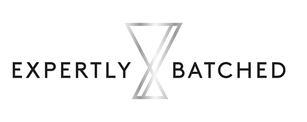
This is paired with format-specific messaging; “expertly batched” on bottles, “shake & sip” on cans, and “flow free” on taps.
Read the full press release here.
Read coverage on The Dieline.
In need of a rebrand?
We can help you reposition and stay relevant.