


Design Strategy, Copywriting, Visual Identity, Packaging, Stationery, Digital Concepts, Guidelines
Redesign of Bristol-based luxury lingerie and swimwear brand Fleur of England, modernising its visual identity and packaging with a sophisticated new look.
“Popp Studio’s reimagining of Fleur of England is feminine, layered and crafted, and the dynamic visual identity system allows our brand to come into full bloom.”
– Fleur Turner, Founder and Creative Director, Fleur of England
Underpinned by the belief that when lingerie fits you perfectly, you feel amazing, all garments in the Fleur of England collection are of exceptional quality and handcrafted with a focus on fit and silhouette.
Founder Fleur Turner sees her brand as a garden, grown and nurtured by her mantra: “If it is not exquisite, it will not leave the door”.
We embraced these ideas, bringing together the provenance story with the garden muse and the perfect fit.
Placing the ‘of’ on the top line brings ‘England’ more visibility and presence. And the confident full stop brings modern emphasis to Fleur's name.
The new logo combines an F and an E in the tip of an elegantly drawn key. It is the key to the perfect fit, and Fleur's garden.
The colour palette now features gold accents alongside a deep green that is not only evocative of a lush English garden, but feels distinctively luxurious.
The wordmark and logo function either as a master lock-up or individual assets in a dynamic visual identity system.
The old-fashioned pink palette and flourishing script logo are discarded in favour of a bold new colour palette, wordmark and symbol.
The key can be cropped or extended to create dynamic and engaging touchpoints.
A secondary palette of softer, deliberately restrained hues have been carefully chosen to feel feminine, sophisticated and complementary to the bolder brand colours.
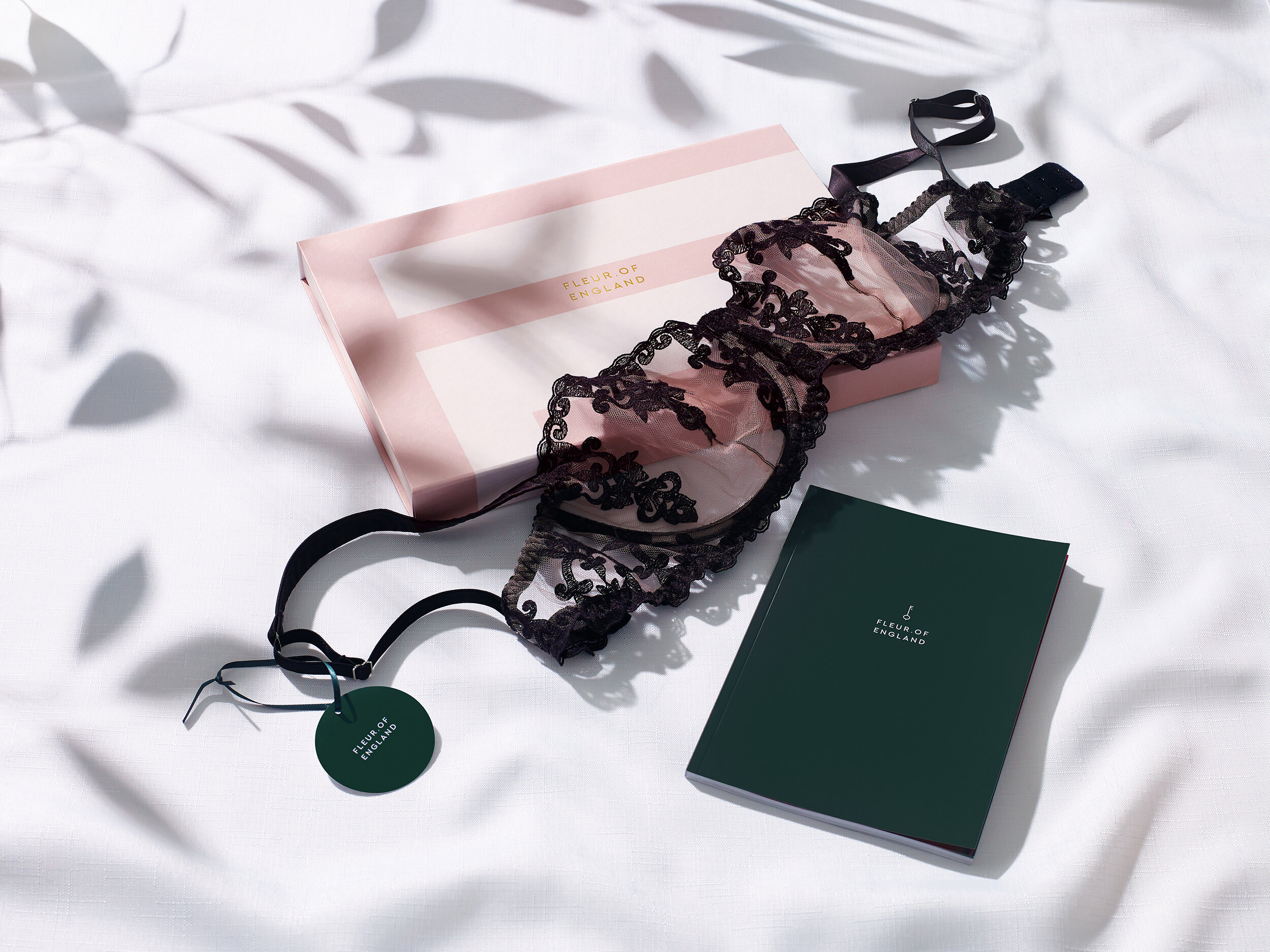
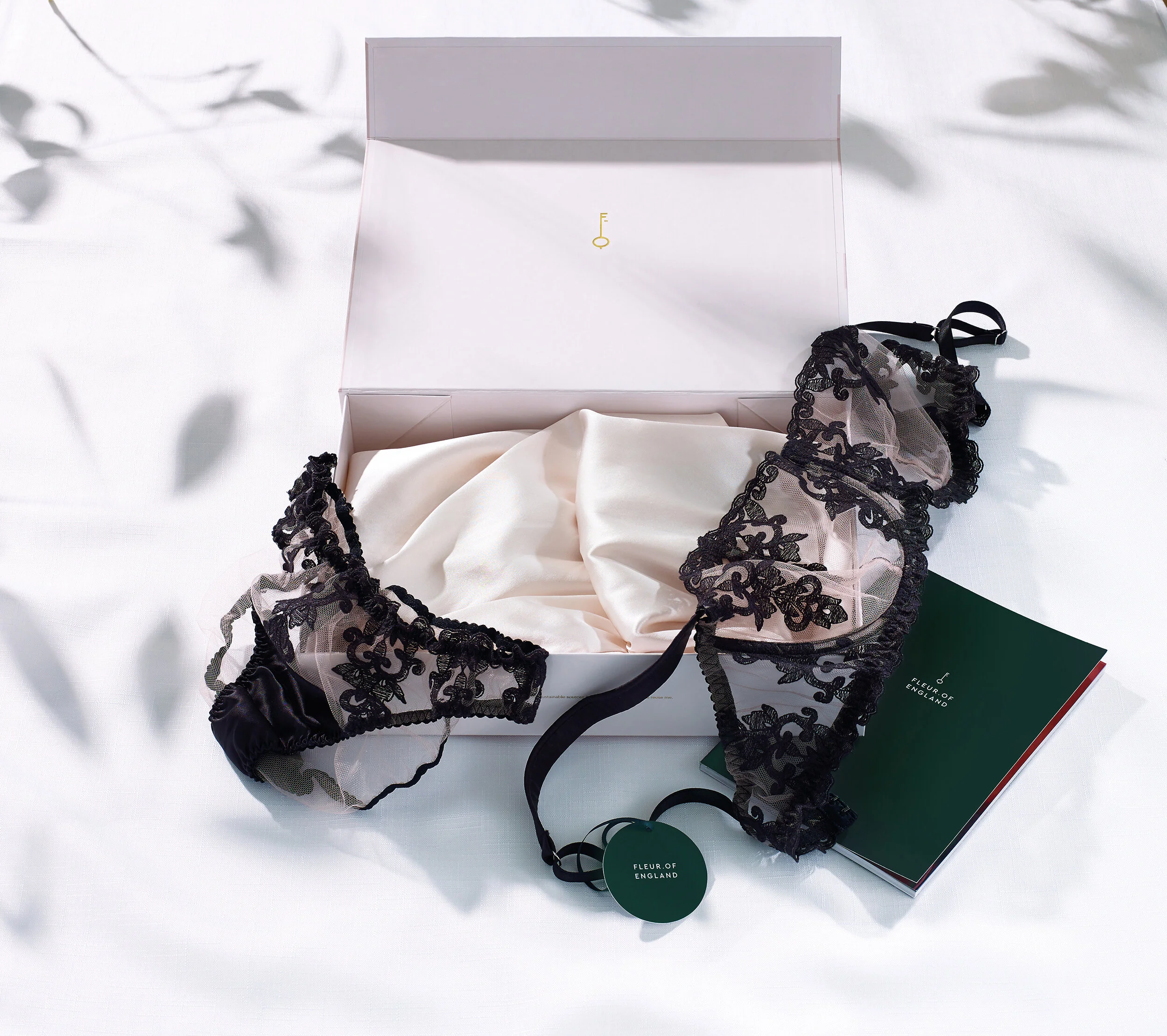
The packaging system has also been completely redesigned to use materials that are more environmentally friendly.
Customers are now offered the option of a beautiful recyclable envelope…
…or a luxurious giftbox that can be kept and reused.
Both feature soft blush colours, and the boxes have discoverable details, such as a gold foiled key on the underside of the box lid and a tessellating pattern effect when they are stacked.
The dynamic visual identity can bookend video and social content.
And rigorous yet accessible guidelines ensure those helping the new identity bloom and grow understand the thinking behind the assets, and are equipped to do their best creative work.
Read the full press release here.
Read coverage on Design Week.
Need to redesign to stay relevant?
We can set you apart from (and above) your competitors.