


Design Strategy, Naming, Visual Identity, Packaging
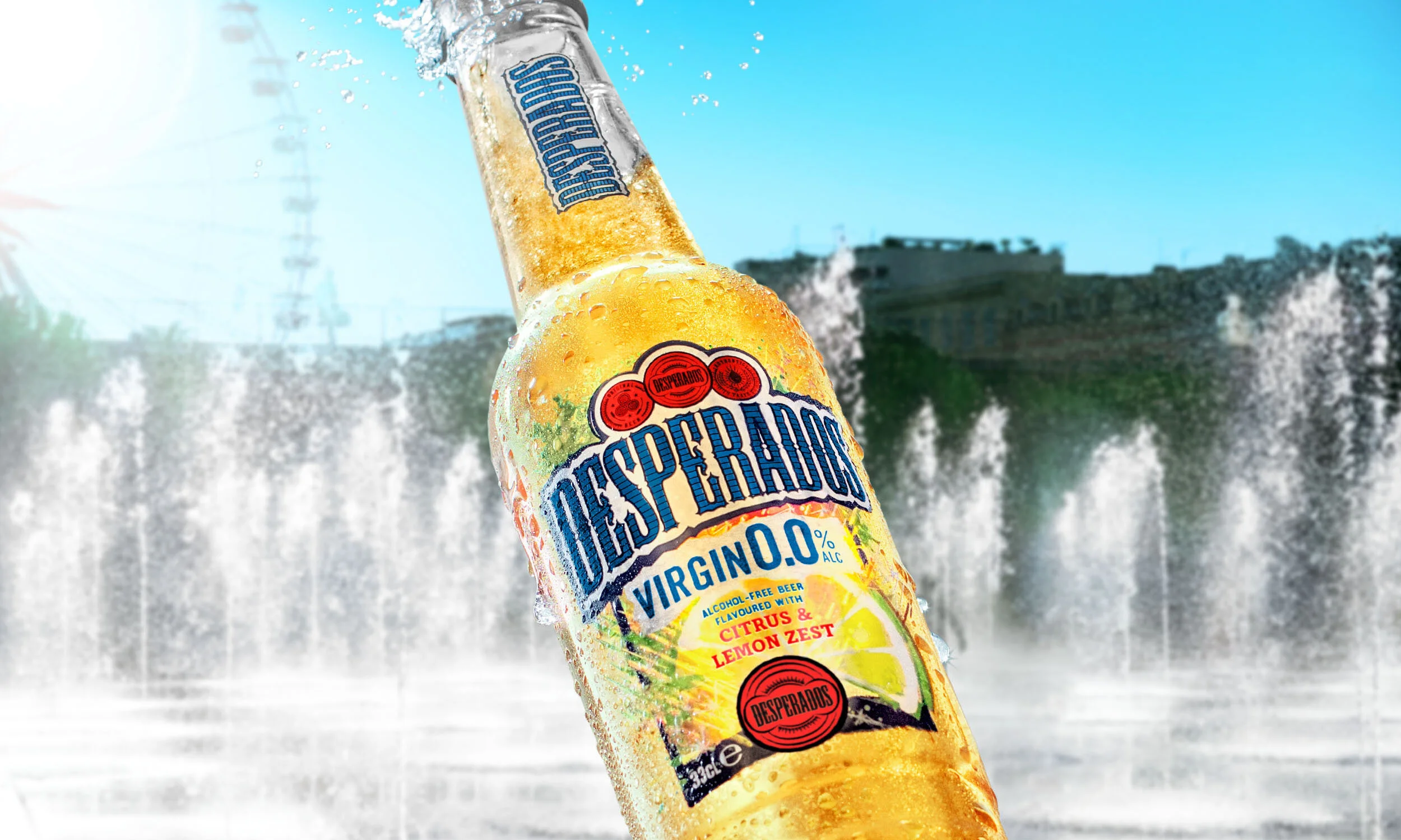
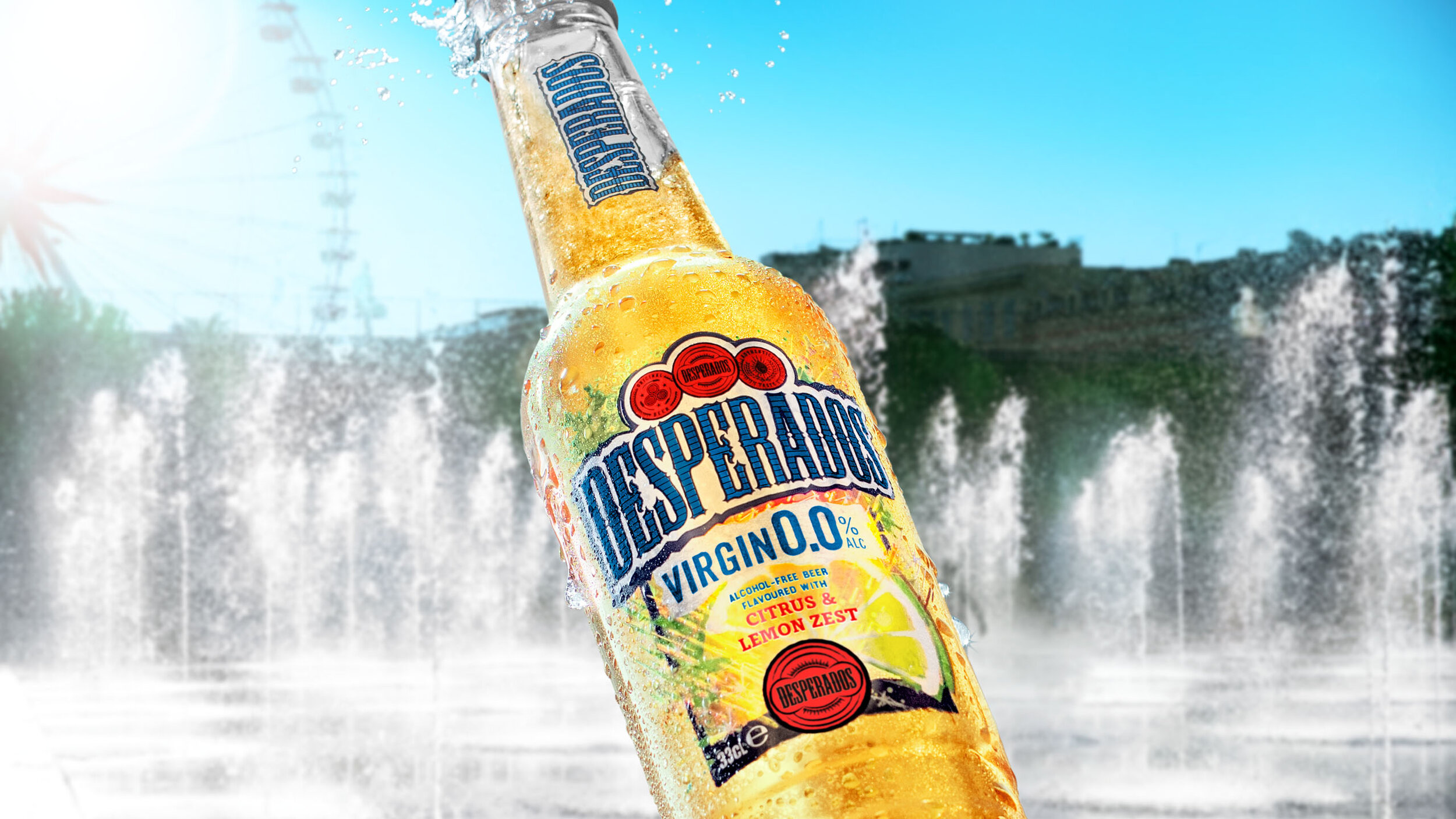
Brand redesign of the identity and packaging for the global expansion of Desperados’ alcohol-free range, Virgin 0.0%.
• 2nd biggest no-alc innovation in key European market after four months
“For Desperados Virgin 0.0%, we wanted to combine clear 0.0% cues with the iconic Desperados vibrancy. With their knowledge of the Desperados brand DNA, we knew Popp Studio’s creative edge and strategic rigour would meet that challenge. They have given us a design that sets us up to achieve our ambitions for global success.”
– Desperados Global Brand Manager
Following an initial launch of Desperados Virgin 0.0% in France in 2020, the brand sought to strengthen its design ahead of the global roll-out this year.
The identity features a new, vibrant blue in the logotype and sub-range name to communicate alcohol-free. The medals at the top of the logo retain the distinctive Desperados red for instant recognition.
The challenge was to keep the party attitude, taste appeal, and vibrancy of Desperados – known for its core range of Tequila-flavoured beers – while communicating 0.0% cues to differentiate it on-shelf.
The bottles, cans, and secondary packaging needed a better fit with the rest of the Desperados portfolio and required a new sub-framework that would easily accommodate new line extensions.
The central medal has been redrawn to remove any reference to an agave leaf, the key ingredient in Tequila, and replaced with a new iconic Desperados medal, inspired by historical packaging designs.
Refreshing, citrusy colours and illustrations hint at the lighter taste profile of new products.
The sub-range identity is set against a dynamic torn-paper shape, a reference to gig posters and the Desperados party attitude.
Going global? Entering a new category?
We’ll set you up for success.