Borrowing other category cues to capture the consumer’s attention
Aesop is a brand deeply favoured by those who appreciate uplifting, elegant, indulgent care that uses sumptuous natural ingredients and understated, sophisticated colours and design. It’s got a loyal audience that feels represented by the aesthetic and nature of the brand.
So when award-winning businesswoman Carina Evans approached us in 2019 with an ambition to launch an all-natural, luxury pet care brand, born and nurtured in the UK, Aesop felt like a brand that had significant parallels in terms of ideals and consumer, albeit in a very different category.
And this raises an interesting point: How do you borrow cues from one category to capture the attention of a consumer in a parallel industry?
Well, first of all you need authenticity.
Luckily, founder Carina Evans has led and defined the pet care industry for 17 years. She was inspired to create the brand that became Be:Loved, after finding an old family heirloom: a farmhouse recipe book of natural remedies made solely using nature’s harvest.
With a knowledge of animal care in the founders’ DNA, the recipes were reimagined and made relevant for modern life to care for and pamper pets and their humans together. That meant that we could build the brand without any reservations about the authority and authenticity of the team behind it.
The experience must deliver on the promise
There’s an unspoken bond between humans and animals, and everything about Be:Loved lets people show their pets how much they care with practical pampering.
The uplifting and elegant product range of Be:Loved shampoo bars, sprays and balms are perfect for everyday indulgent care. Whilst the sumptuous, moisturising ingredients protect and nourish hands while giving pets a natural boost, even those with sensitive skin.
But branded packaging must serve up the same experience as the product, as Popp Studio Managing Director and Co-Founder Andrew Slade says:
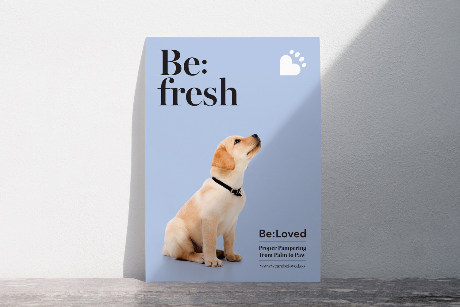
“We chose the name Be:Loved as a simple encapsulation of that intangible connection between pets and pet-parents: “be loved” by your “beloved” pet. The strapline “Proper Pampering from Palm to Paw” positions the products as both effective and indulgent, and emphasises the benefits to both the pets and those doing the pampering.”
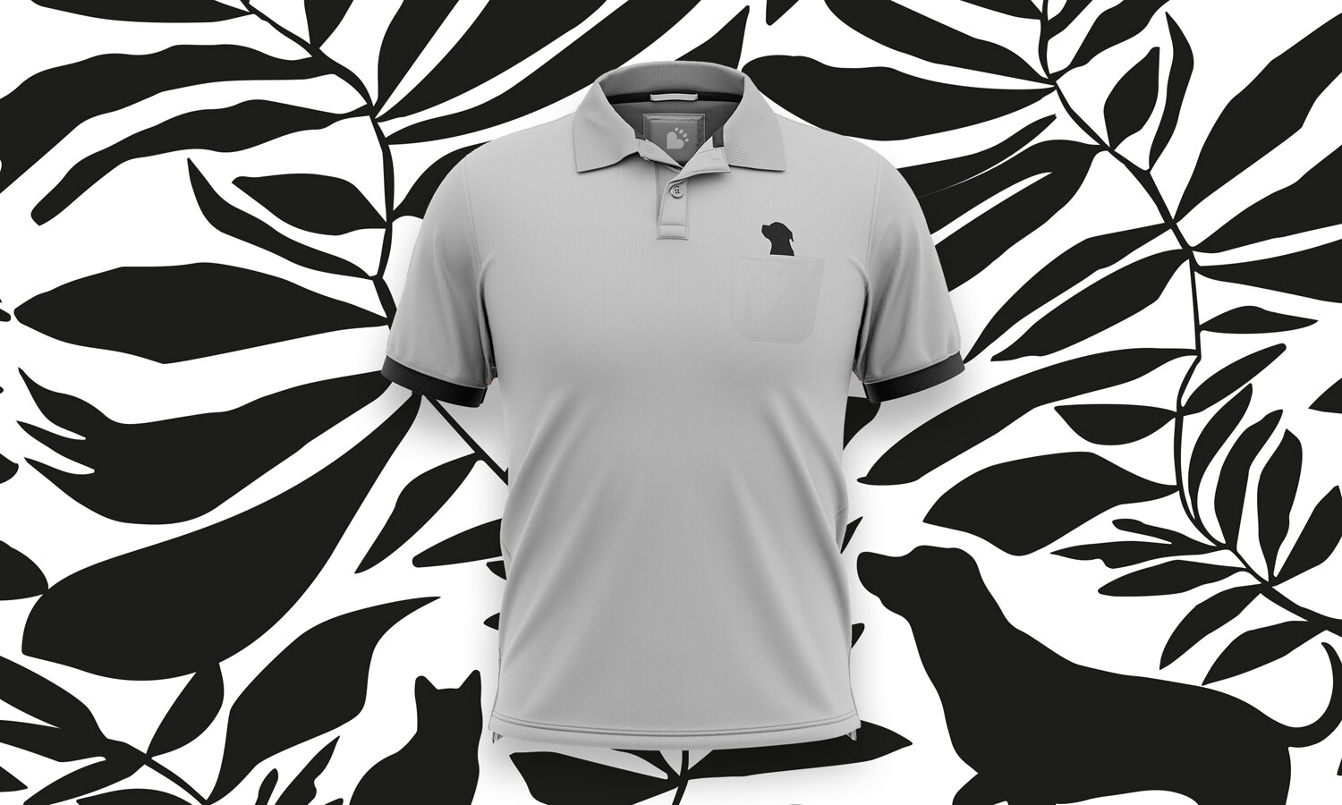
The logo combines a B-shape, paw and heart in an irresistibly cute, distinctive asset that is paired with a simple wordmark with a colon that hints at the play on words in the name.
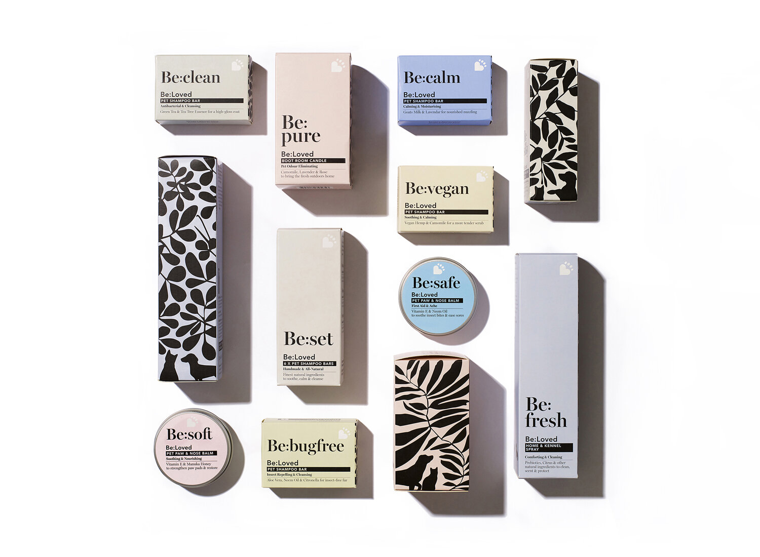
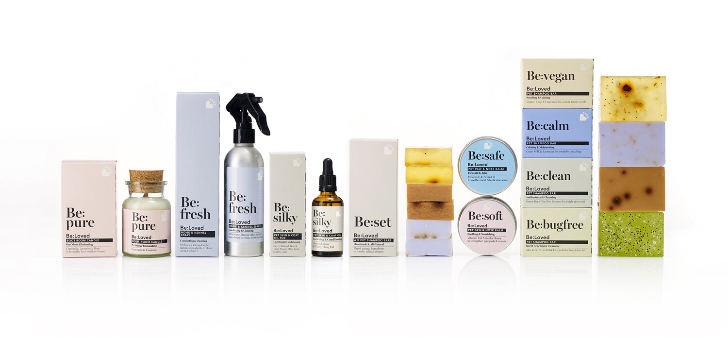
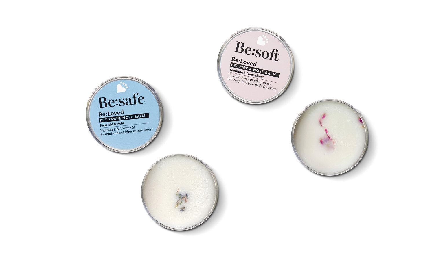
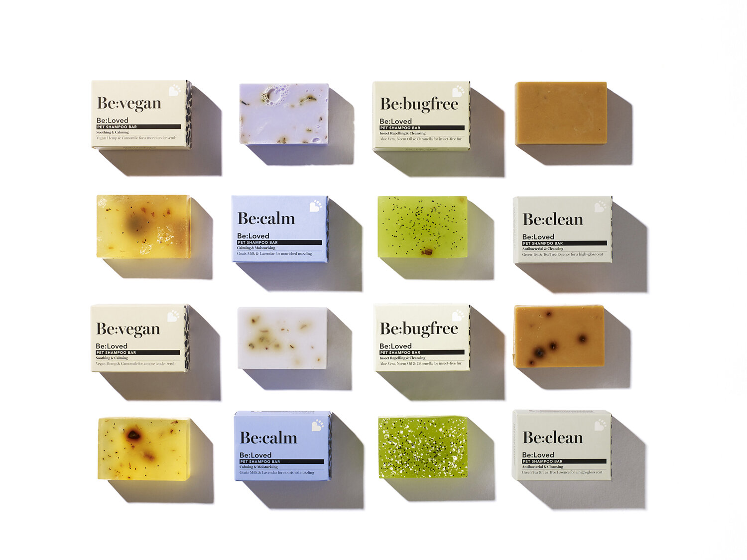
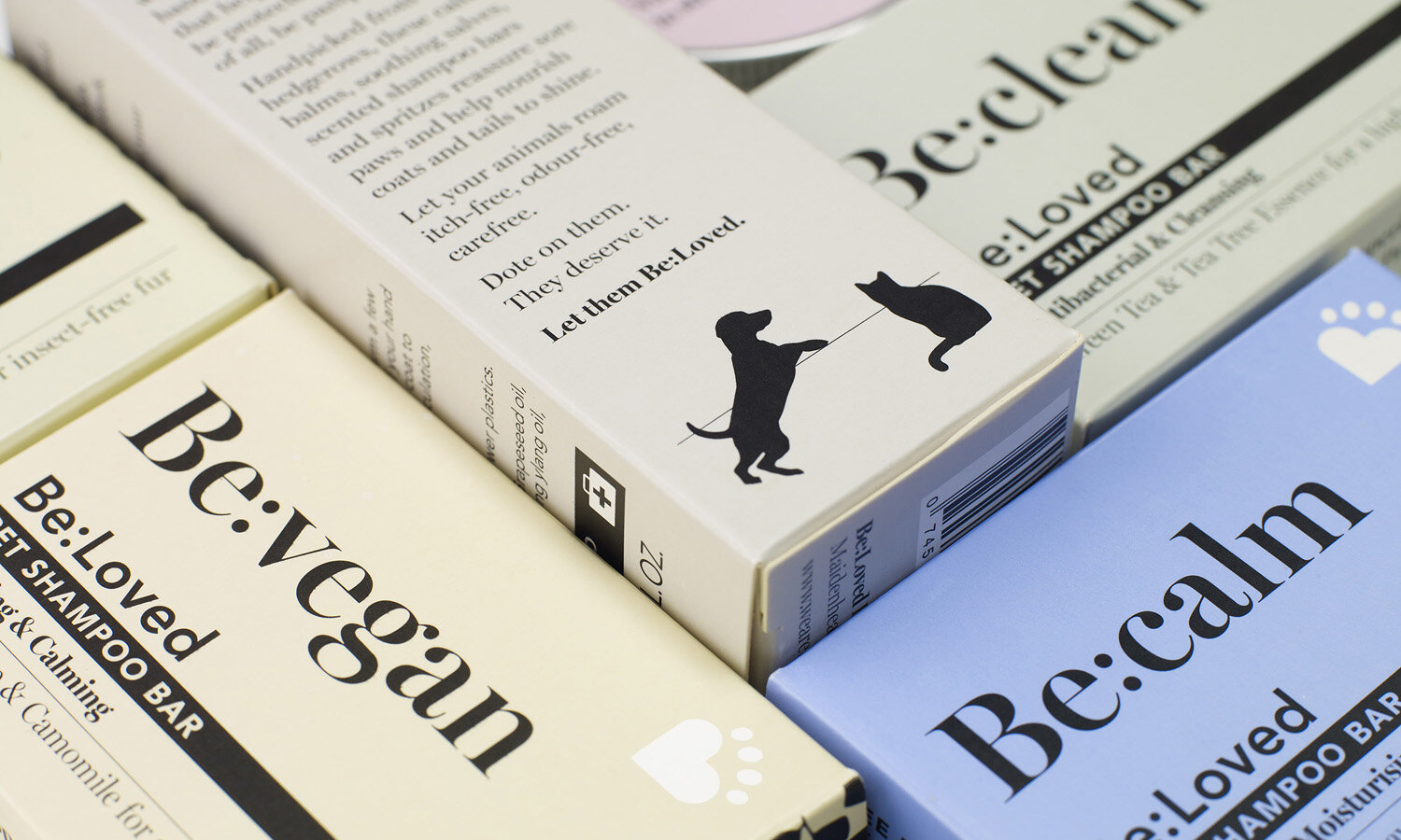
This “Be:” device flexes across packaging and throughout the brand world placing the different benefits of each product in the spotlight, and the range as a whole. “Be:Safe” features on the nose and paw balm. “Be:Silky” evokes clean, soft fur after a rub from the coat oil. Lastly, “Clean, Calm, Vegan and Bugfree” speak to the different benefits of the shampoo bar range.
The look must fit right into the consumer’s lifestyle...
The understated, sophisticated colours chosen for Be:Loved fit perfectly with the décor of modern homes, and the considered designs mean that pet products can be displayed confidently alongside other premium beauty or home care products.
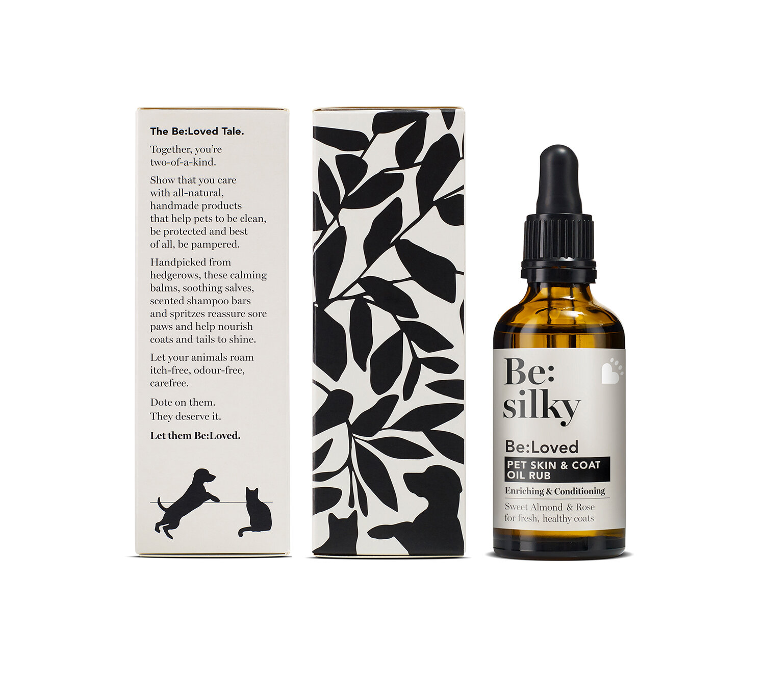
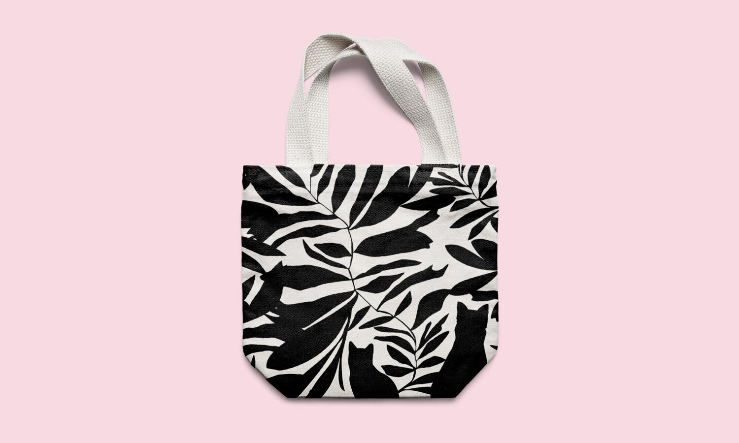
The Popp team was inspired by the idea “hidden in the hedgerows” – the root of many of the ingredients – and thus created silhouette illustrations of plants with cats and dogs hiding amongst them as a fun, discoverable feature.
The brand story is both playful and poetic, and encourages people to dote on their pets, and “let them Be:Loved.”
Be:Loved Co-Founder Carina Evans says:
“We had a real challenge in creating a brand that combined the desirability and aspiration of the beauty world with the friendly feeling of pet care. Popp has created a brand that straddles these worlds in a distinctive way and sets us apart from the rest of the category.”
And marry with their ideals
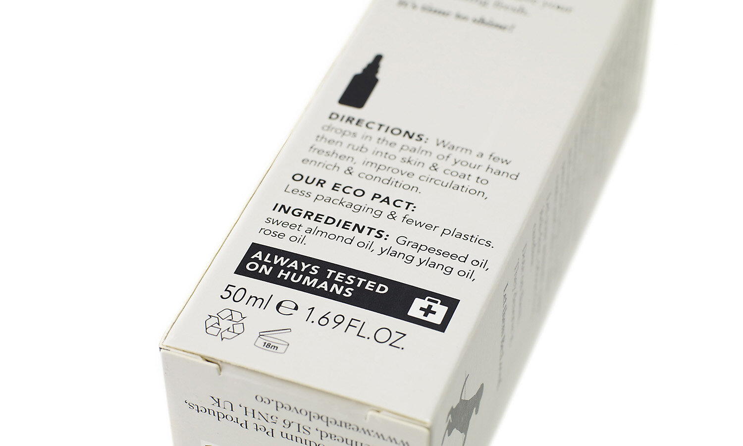
Handmade and all-natural, the range was reared on the philosophy that we don’t use “chemical-packed products on our own skin, so the same should go for our pets.” With this in mind, the message “Always tested on humans” is proudly displayed on the back of the outer packaging.
Popp Studio Creative Director and Co-Founder Poppy Stedman says:
“We aimed to create a verbal and visual identity that was authentic, positive and indulgent. Be:Loved balances the cute, lovable side of having a pet, and includes those can’t-help-but-smile moments, with a stylish aesthetic you’d be proud to display in your home. Knowing the products are completely safe and natural means pet-parents can relax and cherish all the special moments that come with having a pet.”
Does your brand have a disconnect with your consumer?
Book a call to discuss how we can help your brand become ‘display-worthy’ in your target customer’s home.
View the case study here.
